St John of God
Client
St John of God
Agency
Red Dog
Role
Lead Designer
Team
Mary Doherty Project Manager
Shona Byrne Project Manager
Susan Carberry Creative Director
Services
Brand Refresh
Brand Hierarchy
Website Reskin
Logo Design
Typography
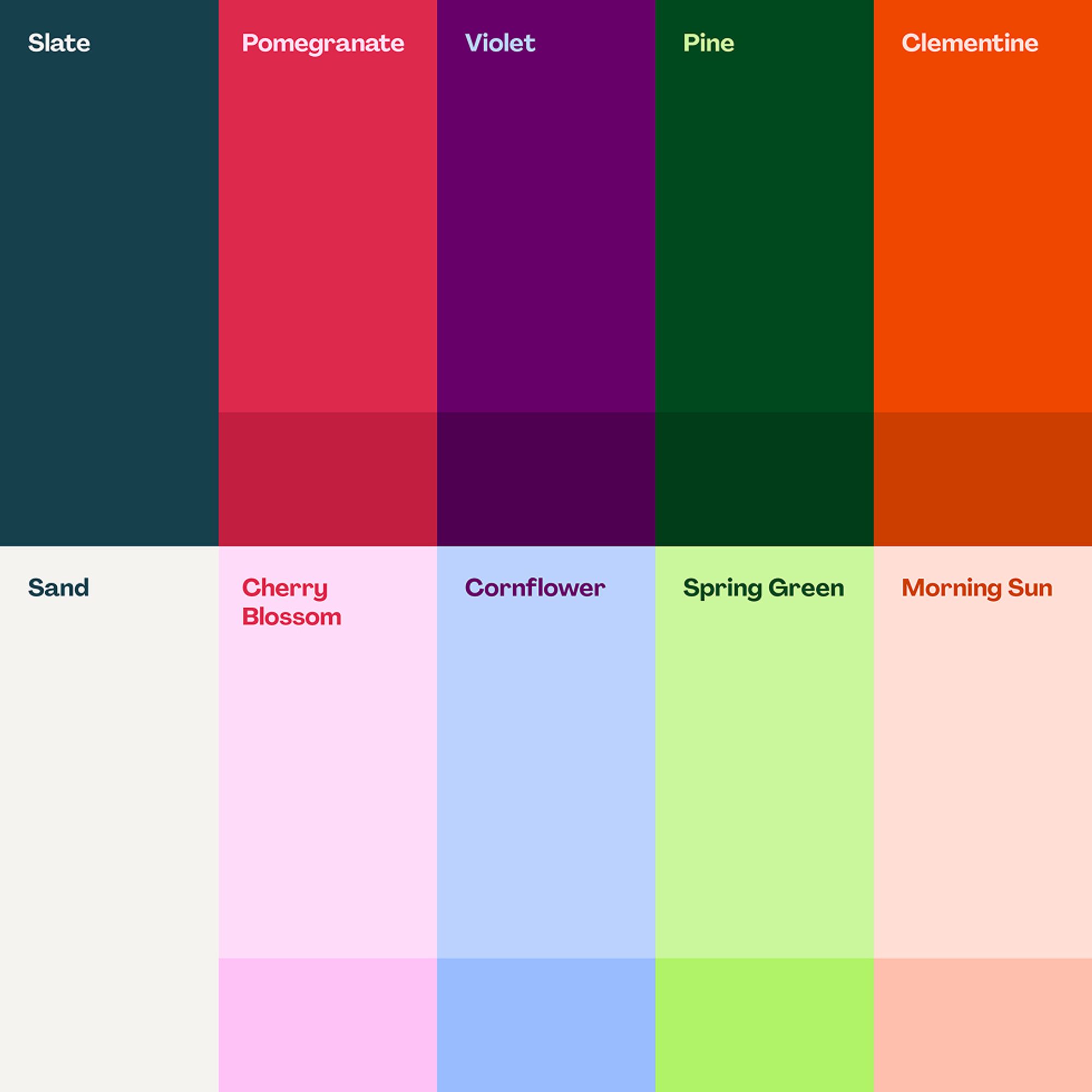
Colour Palette
Illustration
Awards
100 Archive 2023 Selection
IDI Brand Refresh 2024 Shortlisted
St John of God is a charitable organisation that provides health, social care and education services for children, adolescents and adults in Ireland and beyond. Partnering with MCCP, our task was to develop a brand for St John of God that tells a story of a modern organisation that’s fit for purpose in a complex and challenging world, and to celebrate the dedication and devotion of St John of God’s people, who make a real and tangible difference supporting thousands of people every day in Ireland.
Overview
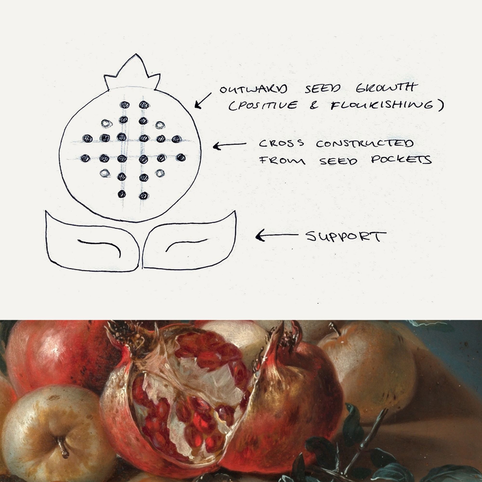
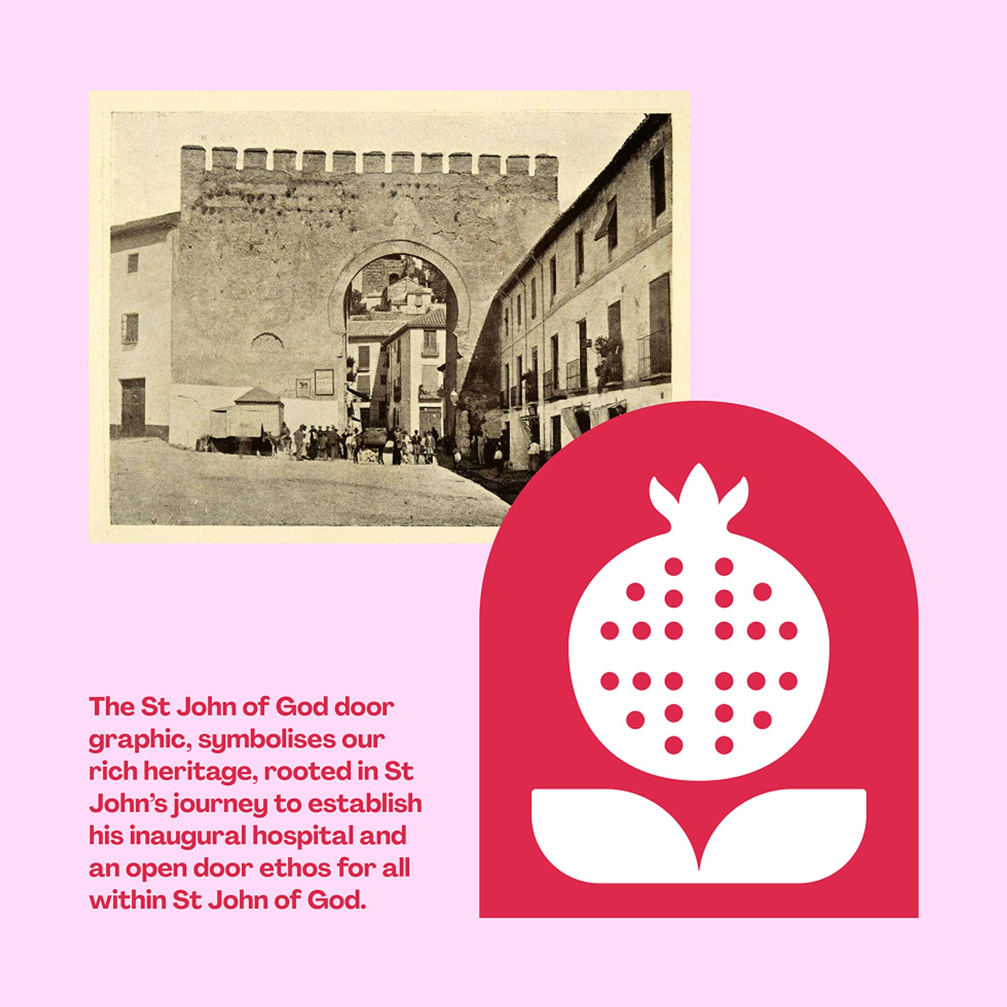
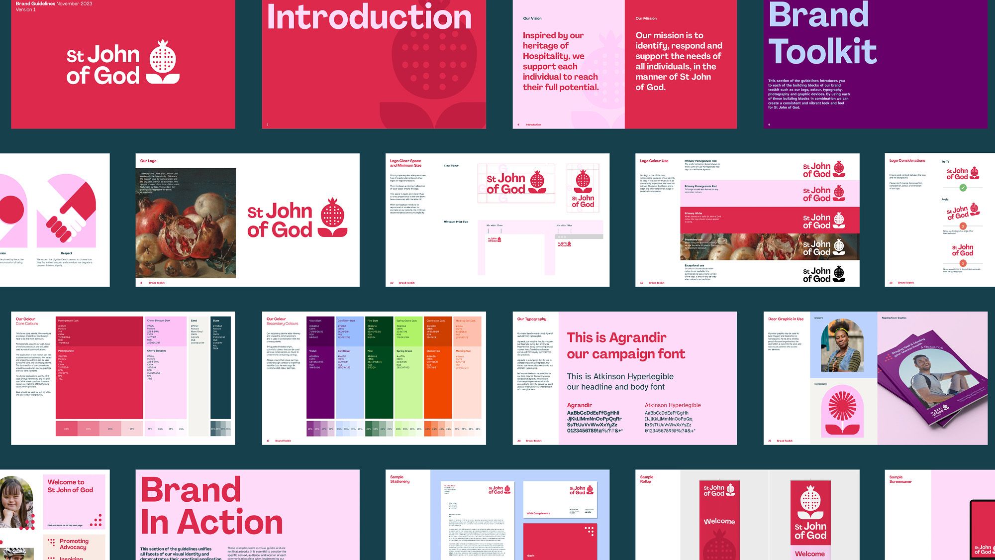
St John of God was born in the Spanish city of Granada. Granada is the Spanish word for ‘pomegranate’ and the city uses the fruit as its symbol. The pomegranate is also a central element in the St John of God brand as it represents charity and hospitality, and the bursting fruit expresses the need for love to expand. Our task was to reimagine the pomegranate for a contemporary organisation and to further draw out its meaning and how it represents the spreading of love and support.
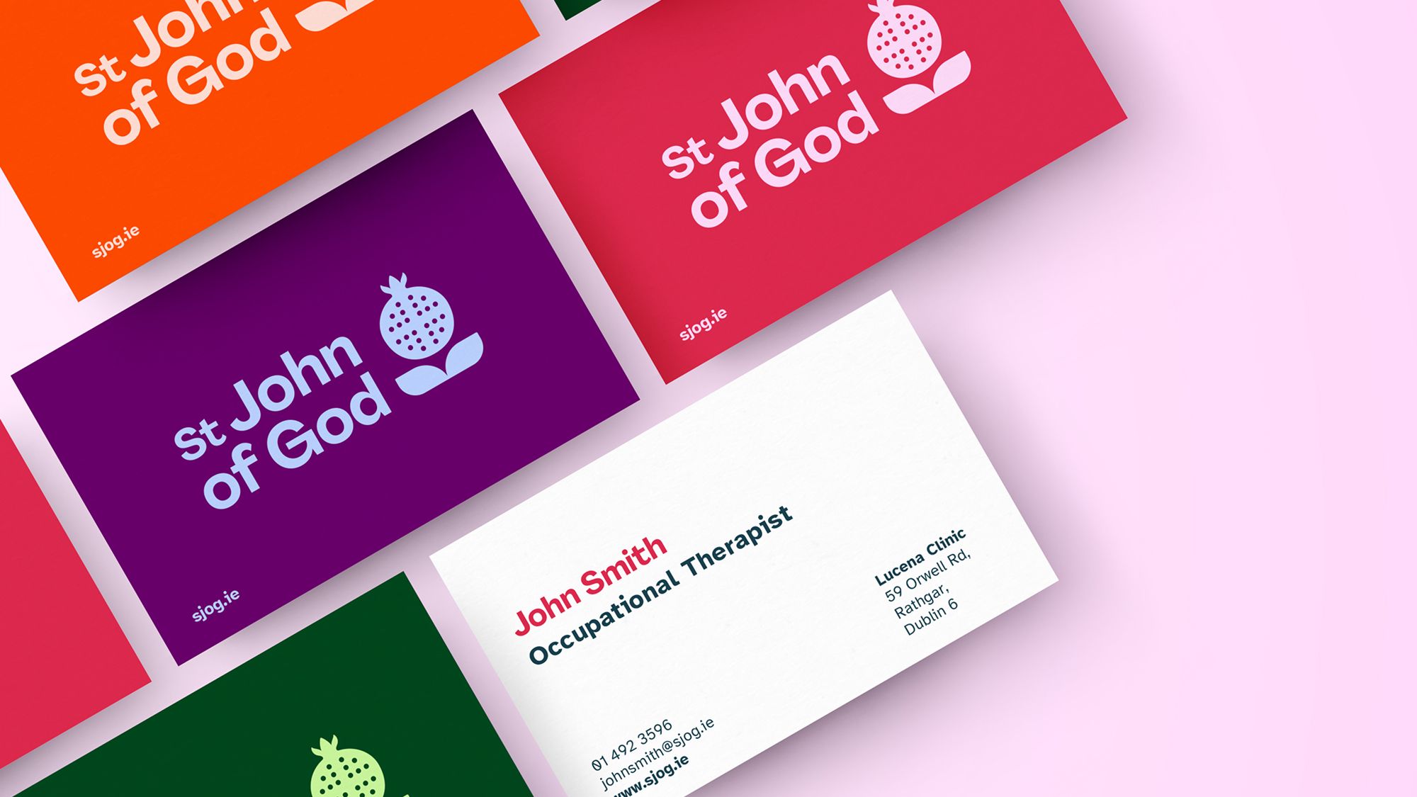
The support that St John of God provide people that helps them realised their potential and possibility inspired our design approach and is conveyed through the pomegranate and the broad, supportive leaves beneath the pomegranate. The inner seeds of the fruit represent both the hospitality that is core to St John of God and the range of services they provide. The seeds also form a subtle cross – a link to the organisation’s heritage. St John of God is set in a modern, friendly typeface. The characters celebrate the beauty of being imperfect and have a warm, human feel. The lockup is modern and adaptable to multiple platforms.
The new brand has a warm, fresh, contemporary and supportive feel that speaks to an organisation that is reflective of modern society and its attitudes, proud of where it comes from and supports thousands of people across their services to realise their potential and possibility.
Challenge
The key challenge lay in reinterpreting the organisation’s work for a modern, more secular audience, while preserving the integrity of its founding values. The new identity needed to resonate equally with all service users, healthcare professionals, and international partners, ensuring it felt accessible, inclusive, and relevant to all.
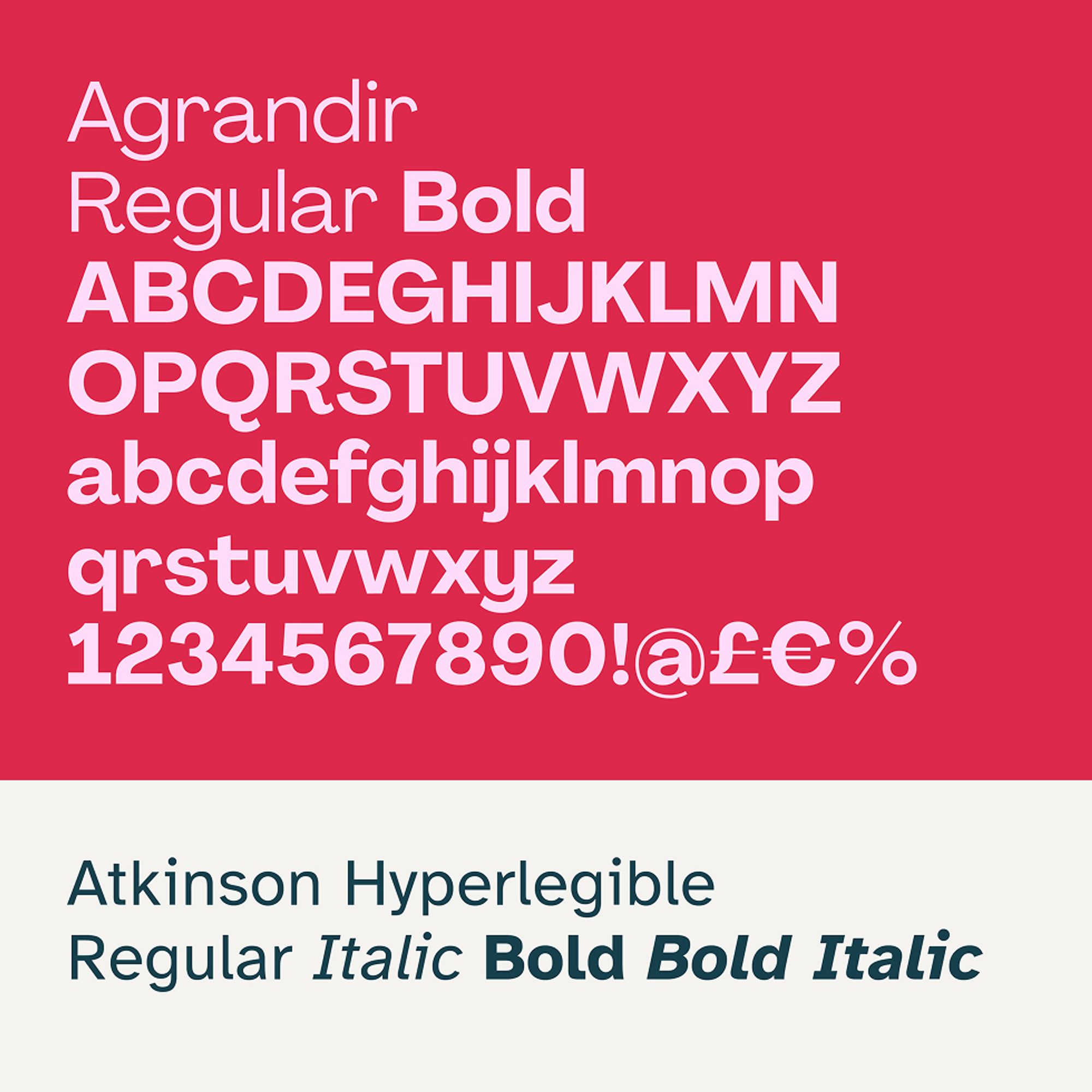
It was important for the brand to feel warm and welcoming, embodying the mission and values of St John of God as an organisation. The colour palette is warm, bright and most importantly, accessible. The primary brand typeface celebrates irregularity and uniqueness while a secondary body font 'Atkinson Hyperlegible' ensures that communications are accessible for all service users.
