ATA
Client
ATA
Agency
Red Dog
Role
Lead Designer
Team
Mary Doherty Project Manager
Paula McEntee Creative Director
Services
Brand Refresh
Brand Hierarchy
Iconography
Typography
Motion
ATA designs, manufactures and supplies precision industrial tools to leading manufacturing industries, including aerospace, automotive and power generation. As part of a strategy to streamline and simplify operations we led a brand refresh that positioned the company for future and further growth.
Overview
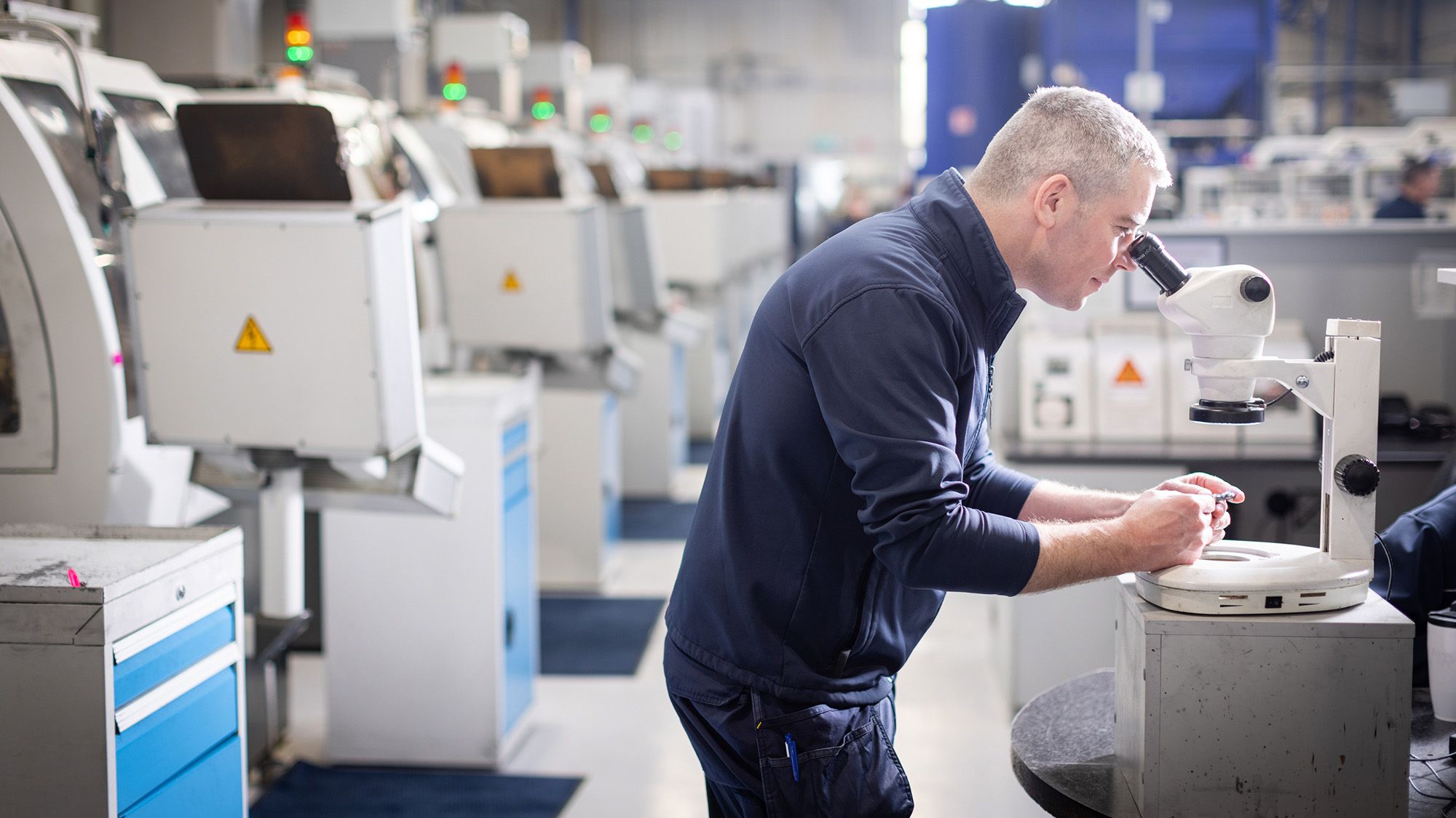
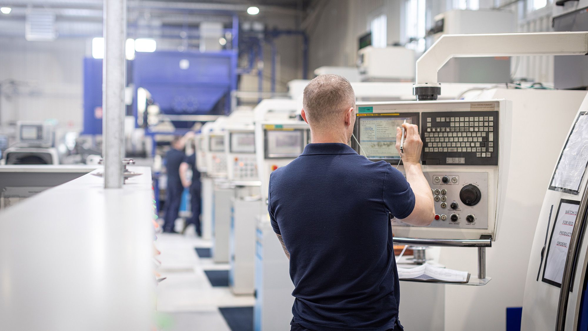
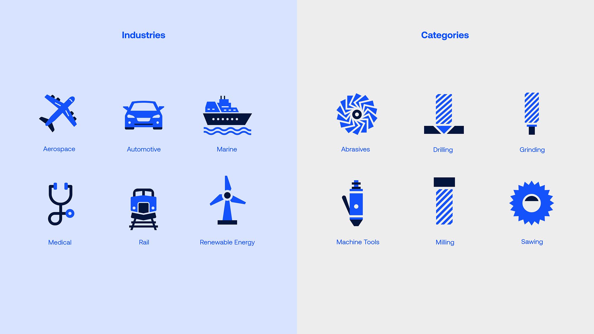
ATA is a precision engineering manufacturer and supplier that produces components for industrial tools used in shipbuilding, car manufacturing and the airline industry. The company is almost 60 years old and has grown significantly in the past 15 years, primarily through acquisition. ATA operates in 10 countries, has 400 staff members, and sells to 90 countries worldwide. In 2021, ATA began implementing a new strategy to streamline the company and simplify its operations to position it for the future and further growth.
As part of that process, ATA realised that their corporate brand required a strong identity with clearly defined values, purpose, and personality to communicate consistently and cohesively across all stakeholders – internal and external. ATA commissioned Red Dog to lead a brand refresh programme, which we began by engaging key stakeholders across the organisation. This process involved interviews and workshops to define ATA’s values, purpose, personality, and brand narrative. The output of this brand strategy work underpinned the development of the new ATA brand identity.
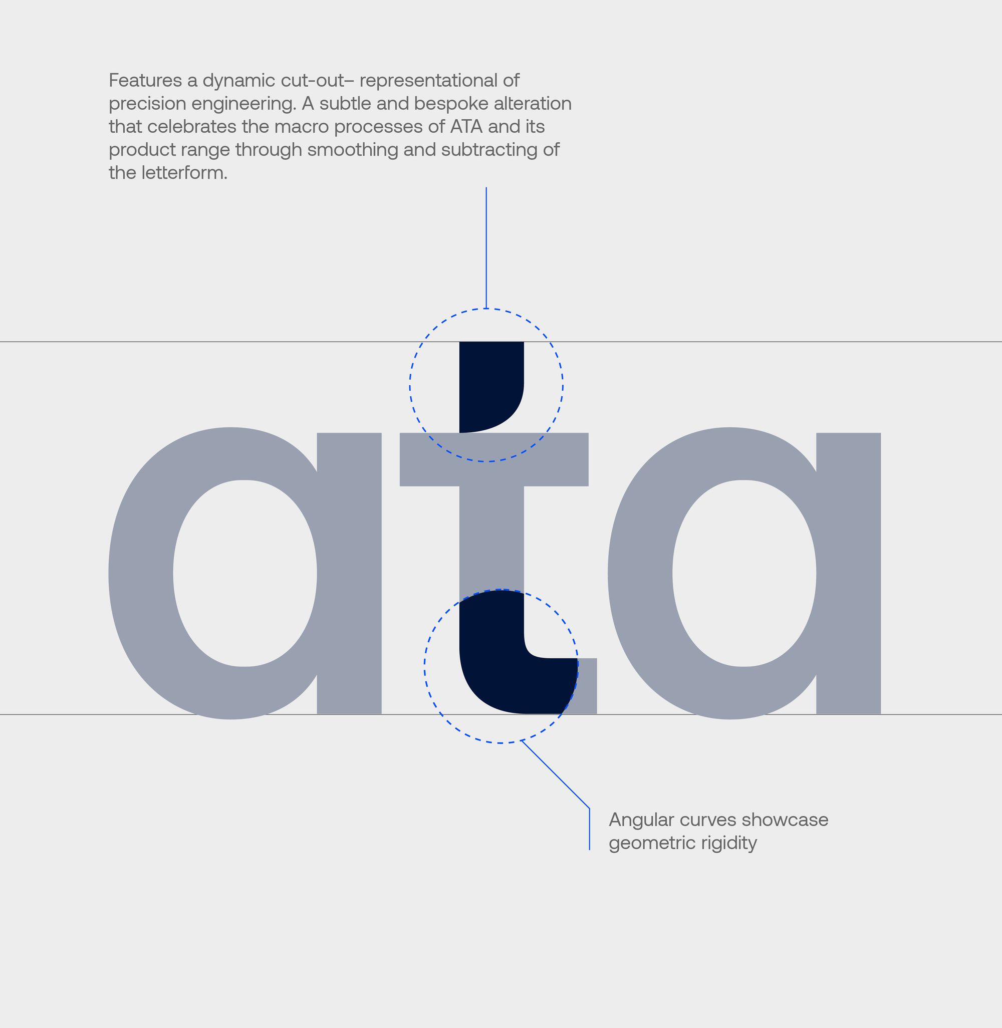
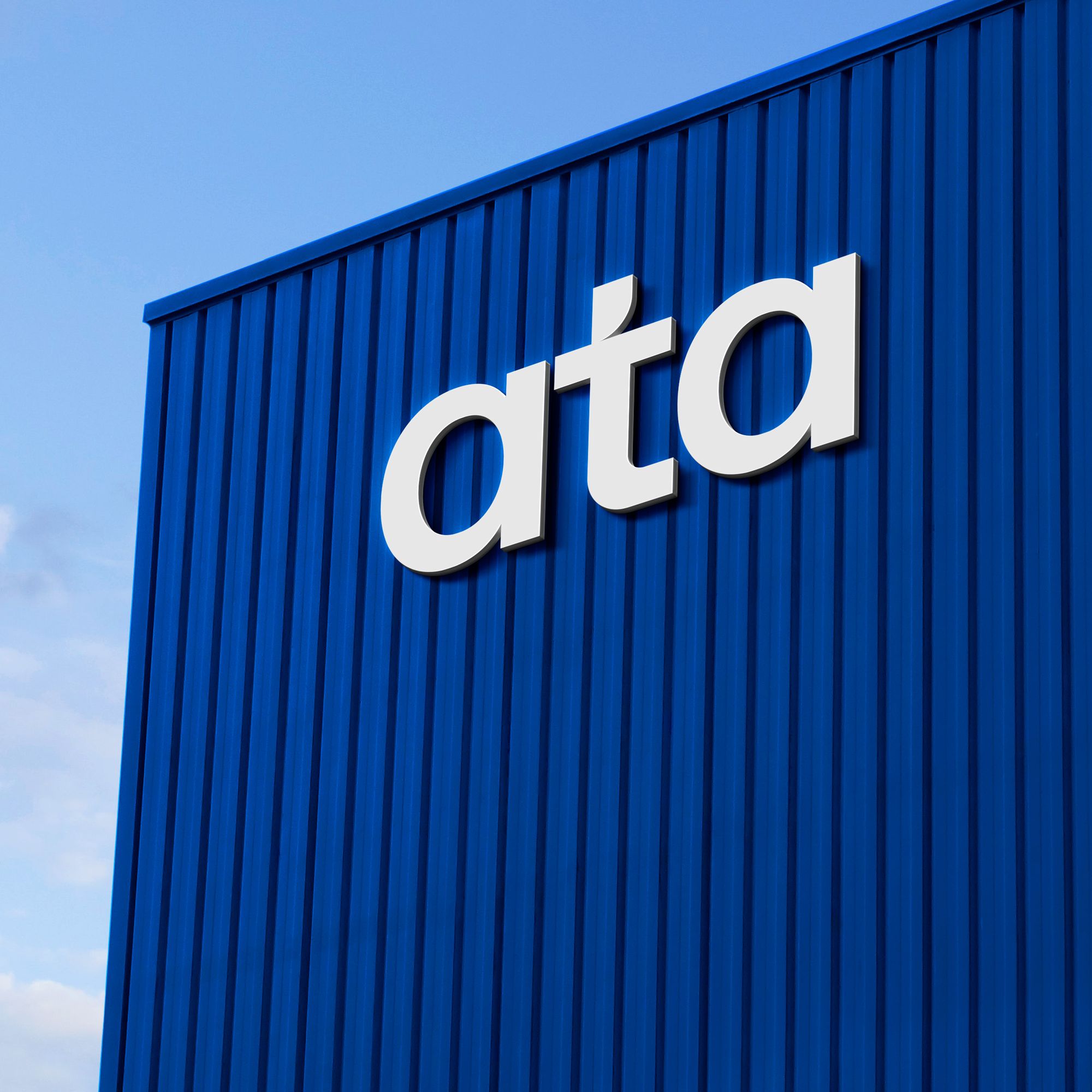
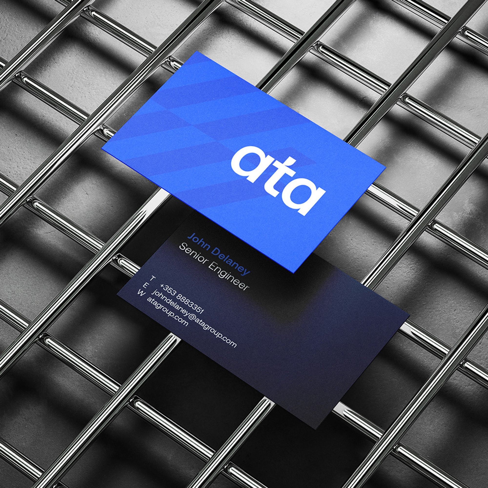
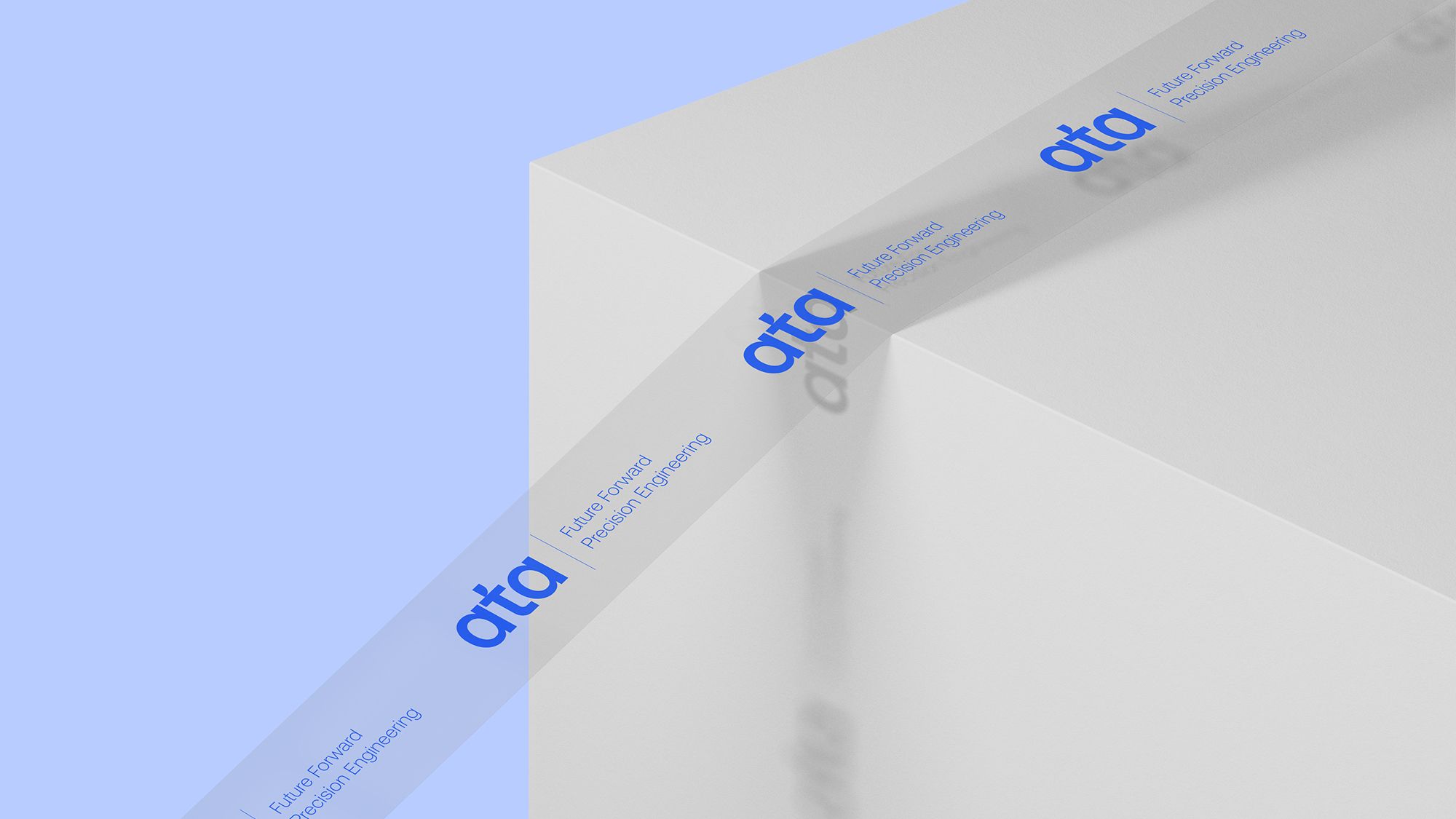
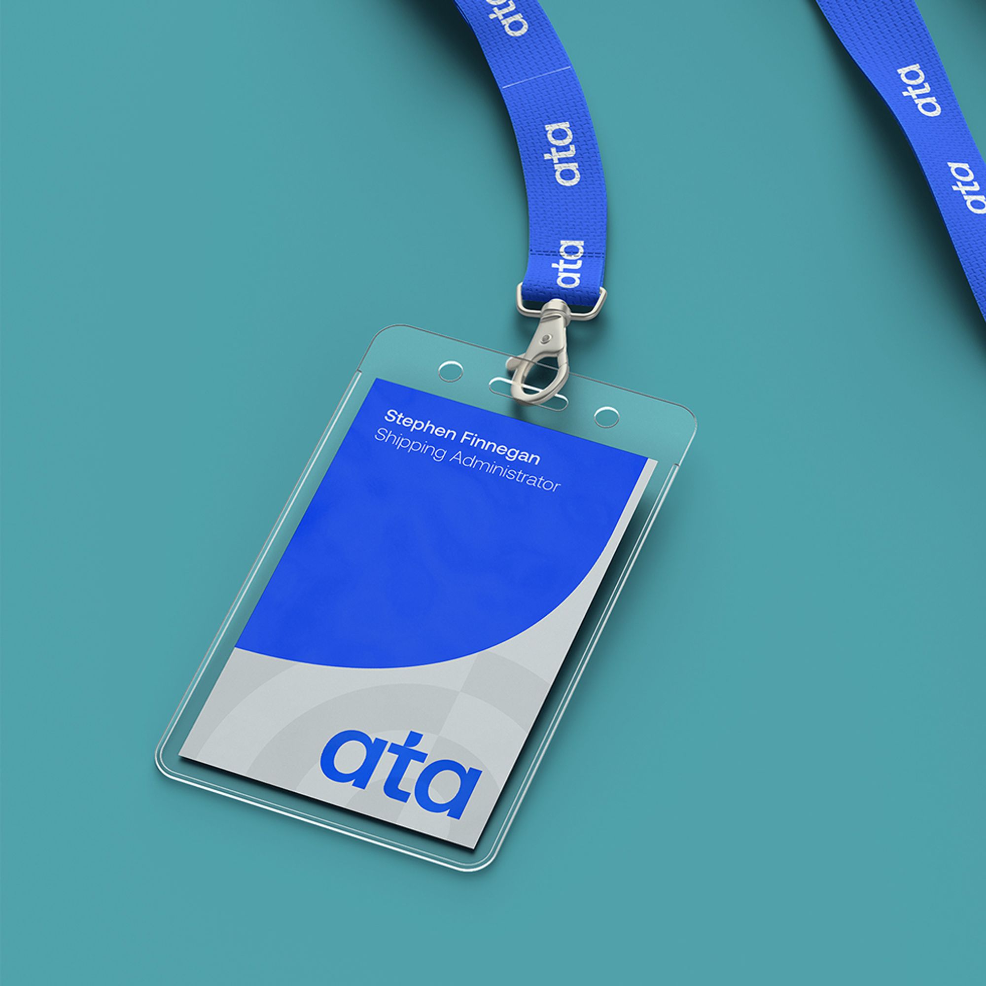
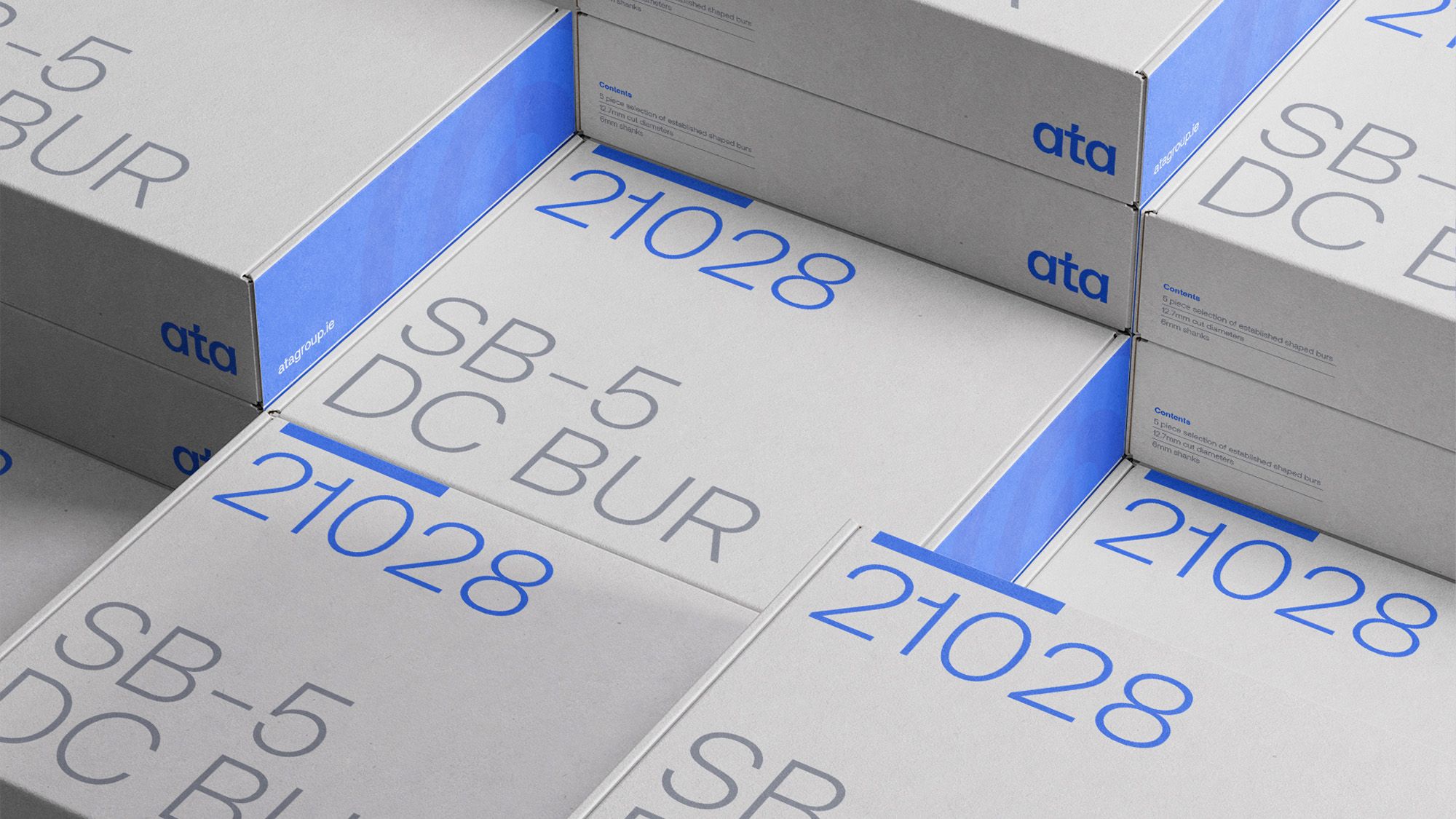
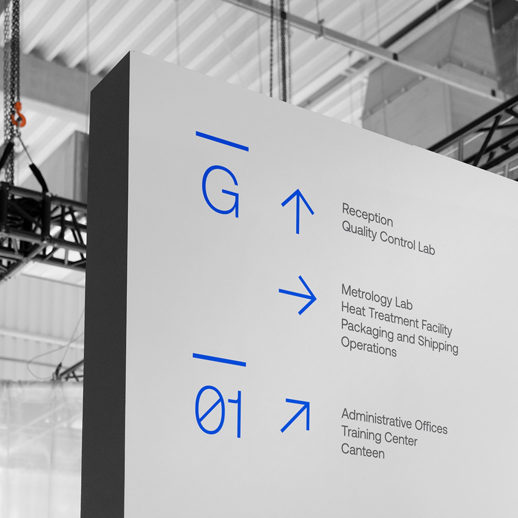
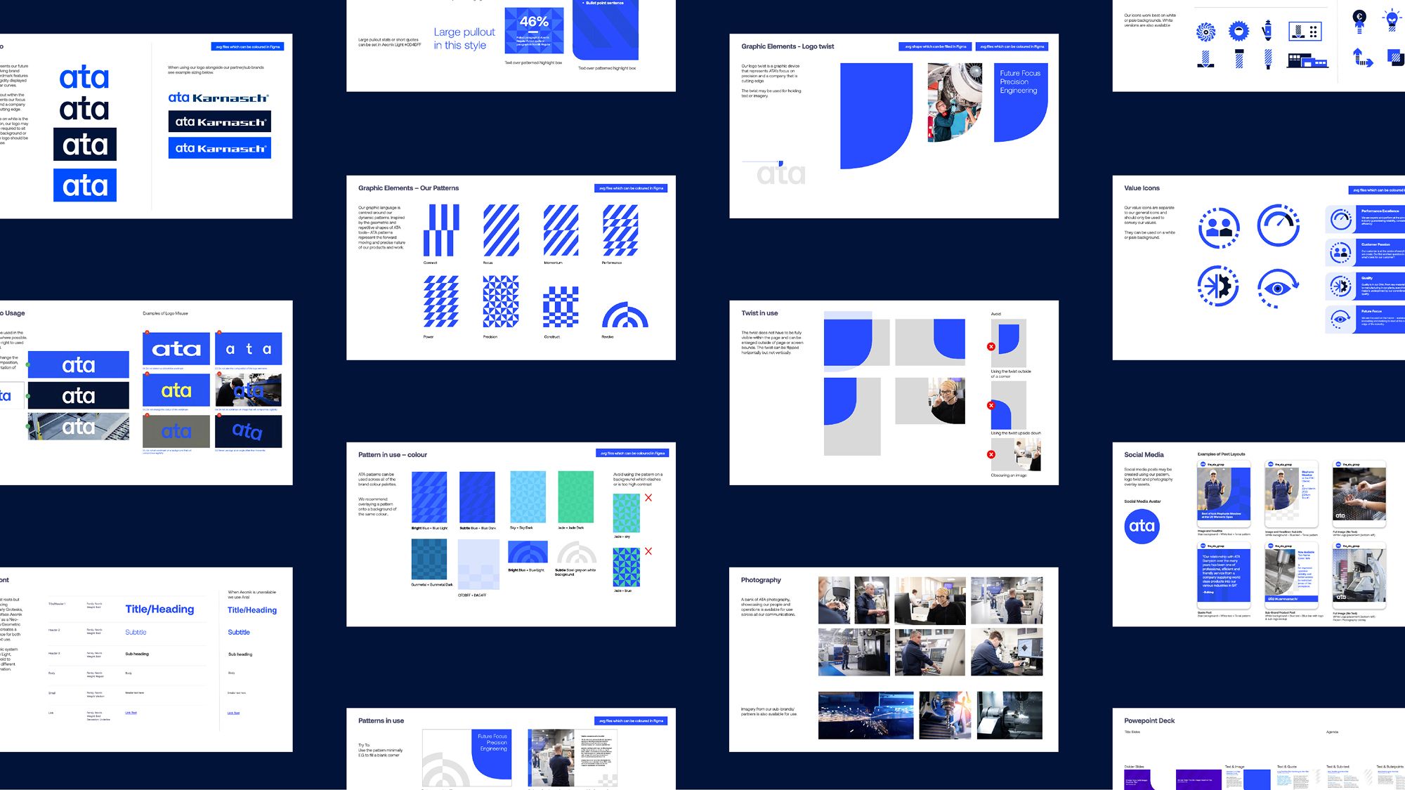
The logo features a dynamic cut-out, representing precision engineering. The cut-out is a subtle and bespoke alteration that celebrates ATA and its product range by smoothing and subtracting the letterform. Micro product details are represented through a subtle typographic treatment in the logotype, and the visual language features geometric patterns inspired by the reflections on metal/movement of light on changing surfaces. Dynamic, evolving, industrial.
Turning to the colour palette, ATA felt that its existing use of blue had substantial brand equity, so we retained blue as the primary colour. We developed two core blues, supported by other vibrant colours inspired by the precision processes.
Challenge
The main challenge was that though ATA had significant scale and reputation, its brand identity wasn’t fully aligned with its newly adopted strategy of growth, simplification and global coherence. It needed a unified visual and verbal brand platform to function consistently across all markets, internal teams and external stakeholders, reflecting both legacy quality and future innovation, and to simplify its identity after a period of growth (including acquisitions) and complexity.