An Táin Pub
Client
Apples and Oranges Limited
Agency
Red Dog
Role
Lead Designer
Team
Ashley Caprani Project Manager
Services
Brand Identity
Logo Design
Typography
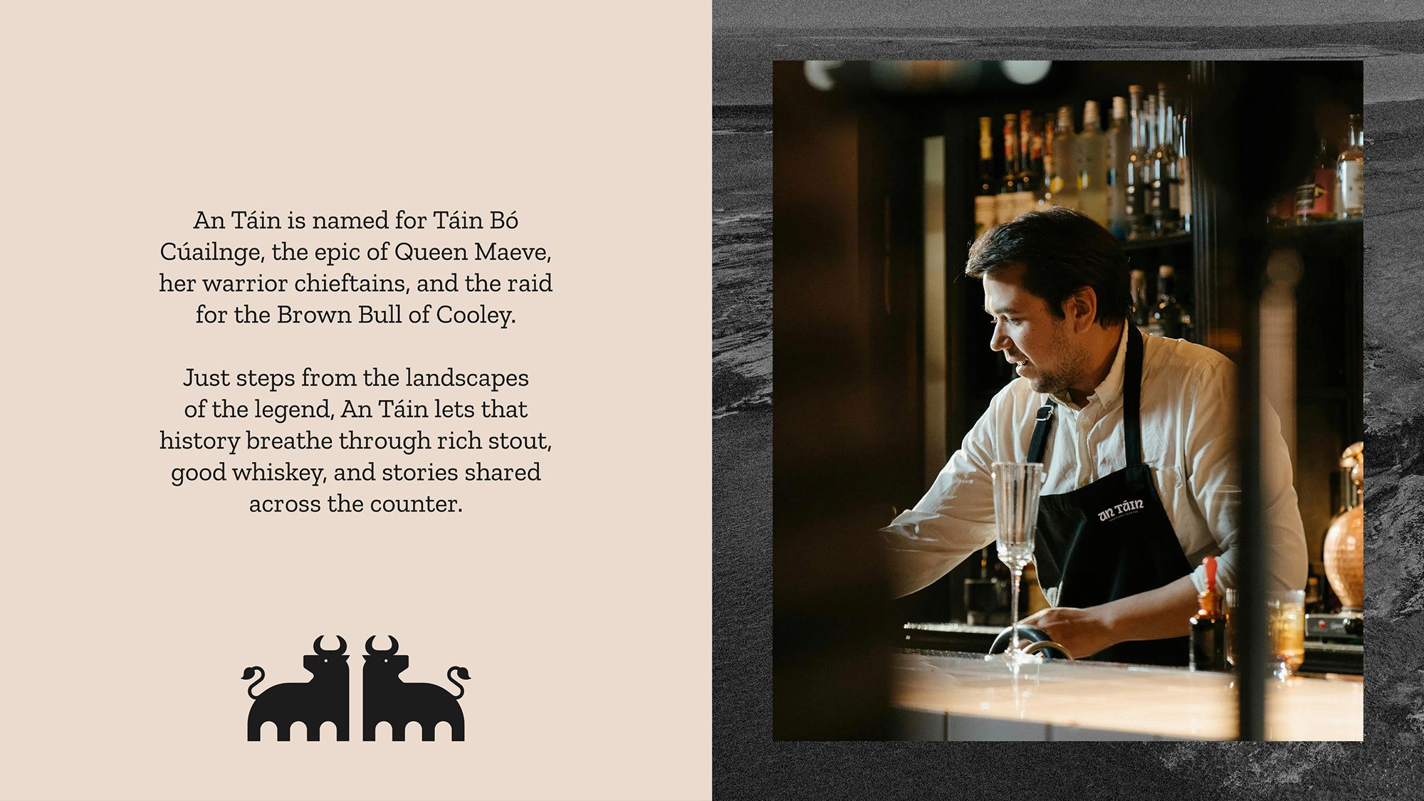
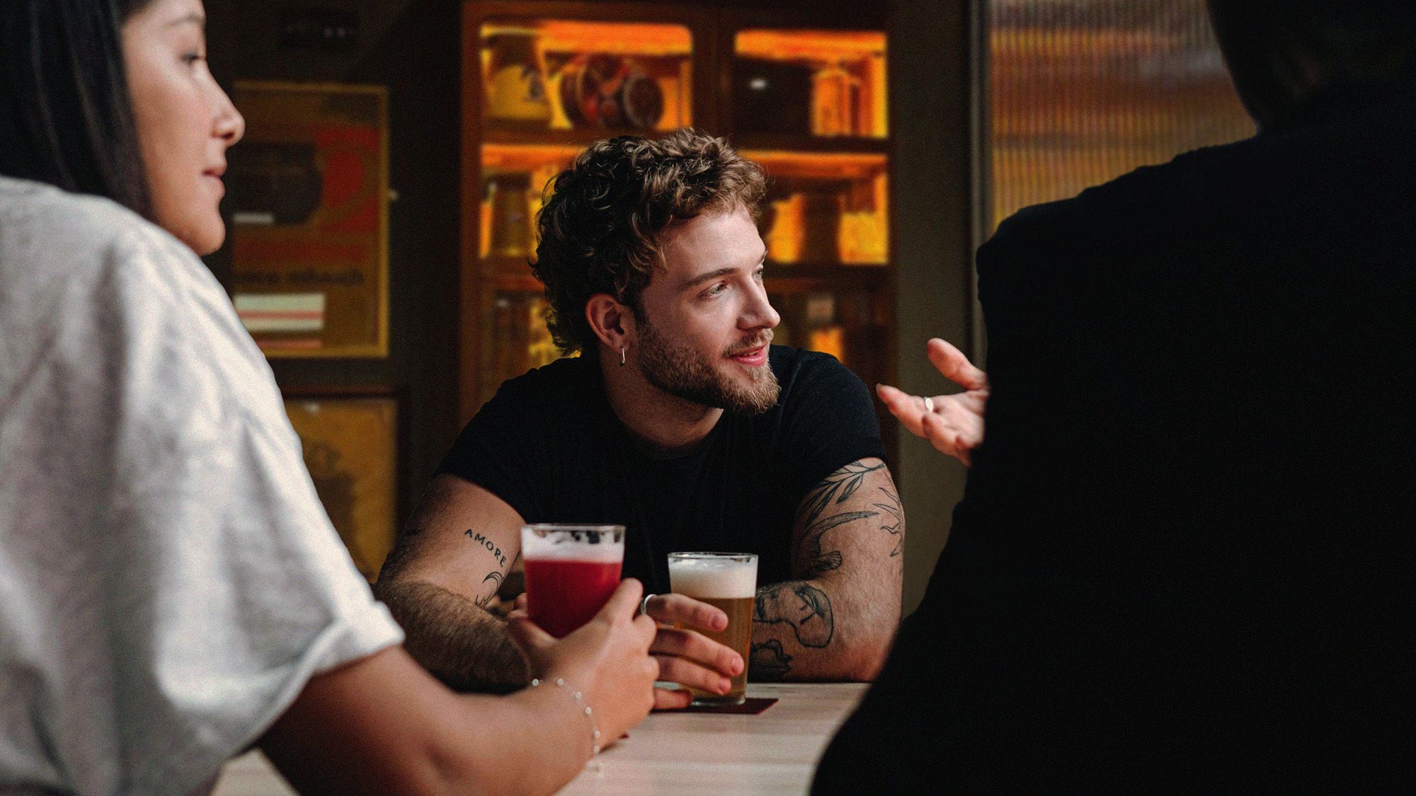
An Táin is a warm, mythology-inspired bar in the heart of Sligo’s Queen Maeve Square. Rooted in Irish storytelling and the legendary Táin Bó Cúailnge, it was envisioned as a venue where people gather for a pint, a whiskey, and great conversation. The brand identity needed to honour this cultural heritage while presenting a distinctive, social late-night destination.
Overview
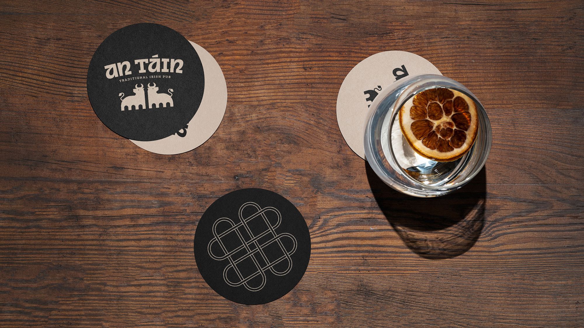
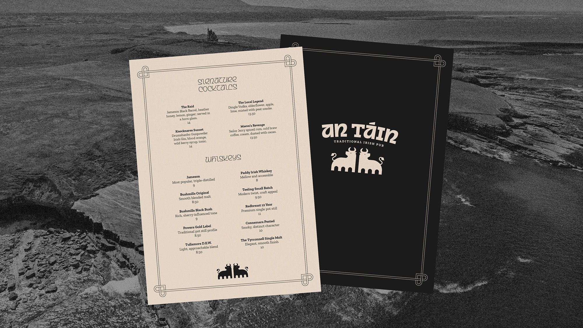
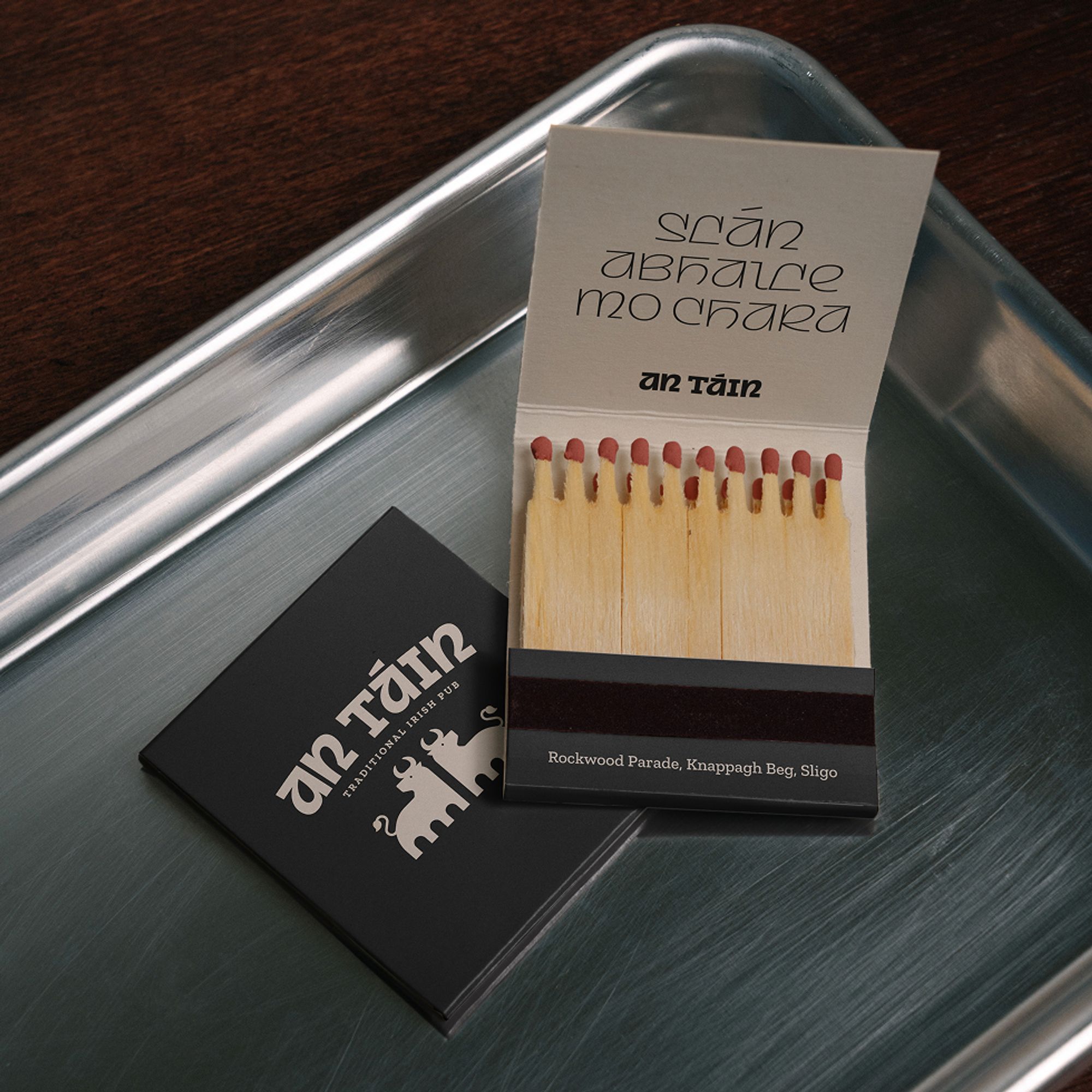
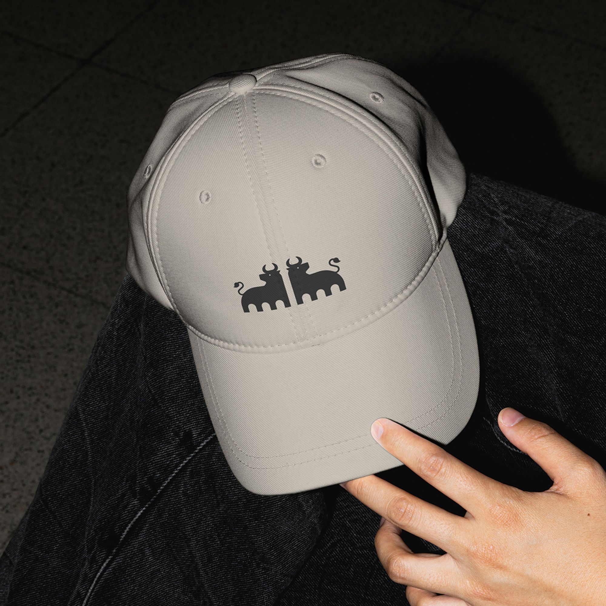
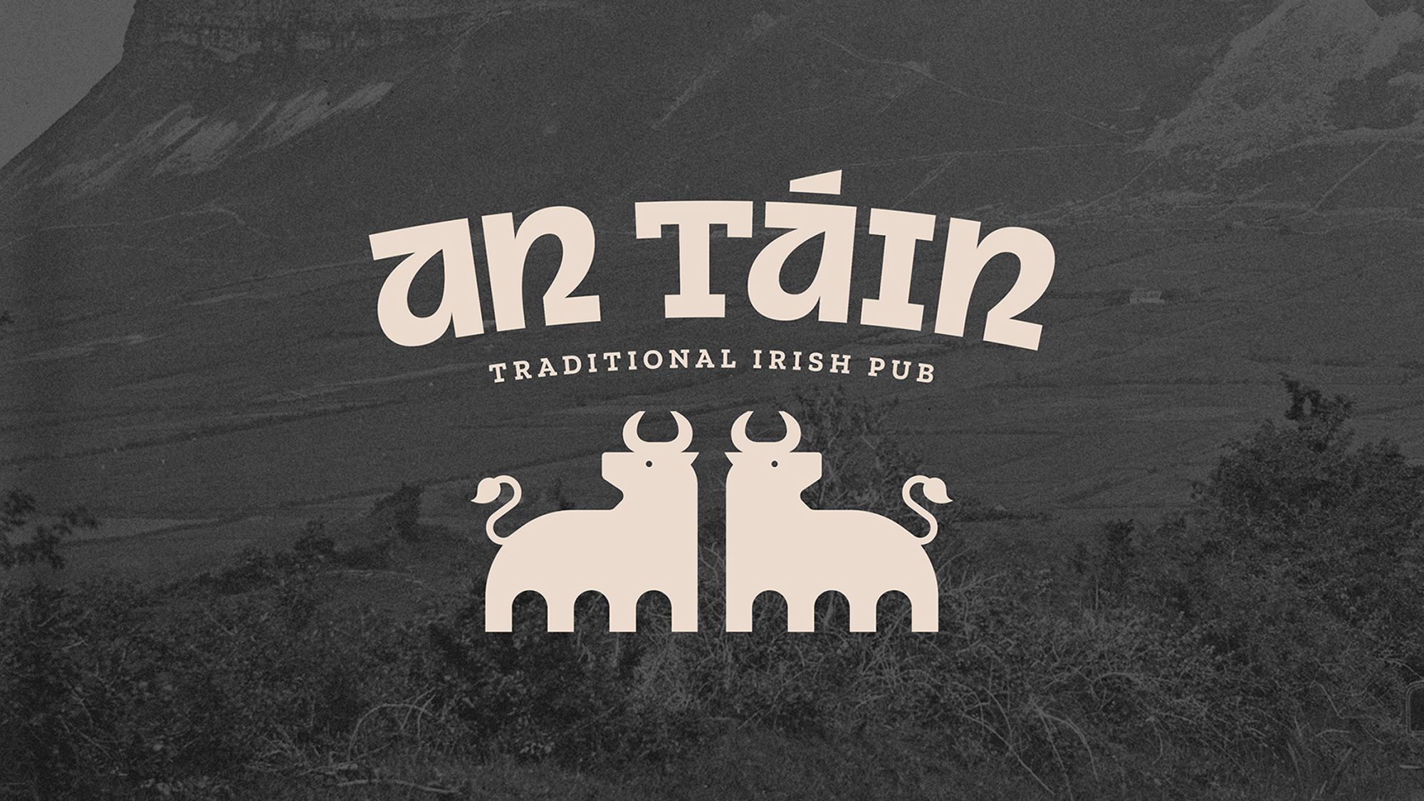
The visual identity draws on Irish mythology reimagined through a modern lens. The logo features two symmetrical bulls, symbolising the legendary conflict at the heart of the Táin with nods to famous architecture of Sligo town. Their stylised form brings a clean, contemporary look to the mythological reference.
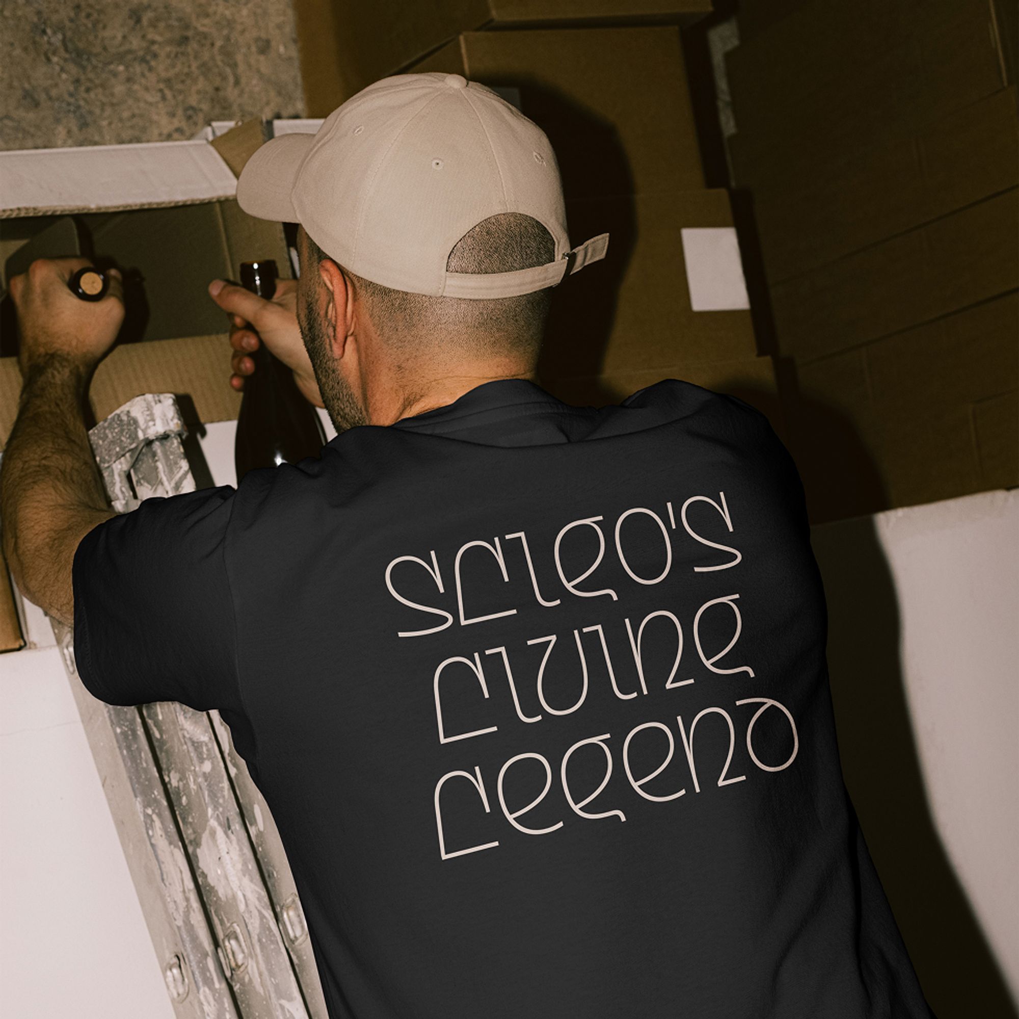
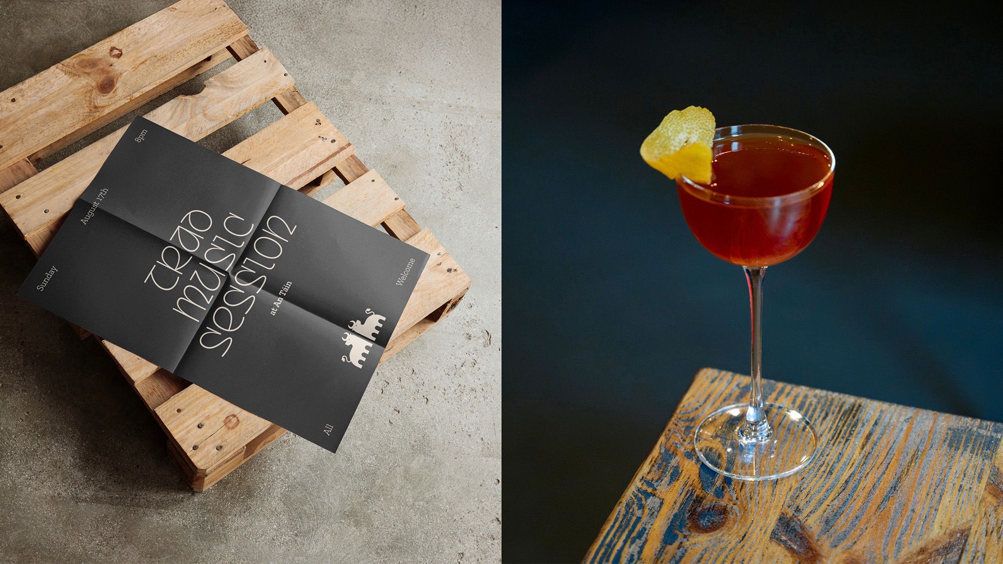
This is paired with a brand typeface that evolves the distinctive character of traditional Irish uncial lettering, giving it a modern feel. Minimal celtic-inspired patterns are incorporated in the brand as a decorative element. The result is a visual language that feels distinctly Irish yet fresh and fun.
Challenge
The key challenge was capturing the essence of Irish mythology and traditional Irish pubs without slipping into pastiche, creating a design that feels timeless yet relevant to a modern, late-night audience. The identity had to stand out between 10pm–1am, appealing to both locals and visitors while maintaining an atmosphere of warmth, authenticity, and depth. Achieving that balance of heritage and energy was central to the final design outcome.
